Data analysis is an important field in business, research and many other areas. Among the many uses of this data, there are helping to make decisions and publish research papers. The weather can also be predicted based on data analysis too. You’ll learn how to perform exploratory data analysis by analyzing musical-related data sets within our project on Spotify Data Analysis. Spotify is the world’s largest audio streaming service and lets you share songs, view lyrics and so much more. You’ll learn about analyzing data, visualizing with Python’s libraries and drawing insights.

We will use the Jupyter notebook to analyze Spotify data, so we will download the data and import it.
To Download Dataset for this project -> Click Here if any issues in downloading Contact US
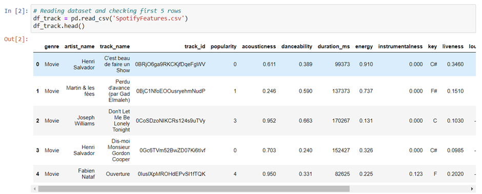
After downloading the dataset, we can open our Jupyter notebook and import the following libraries: pandas, numpy, matplotlib, and seaborn.
The dataset can be imported to Python by using the read_csv function. I have stored the dataset in the folder. Let’s import and view the first five rows using the head() function.
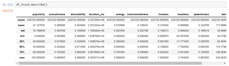
Check description of the data with describe() function present in Pandas.
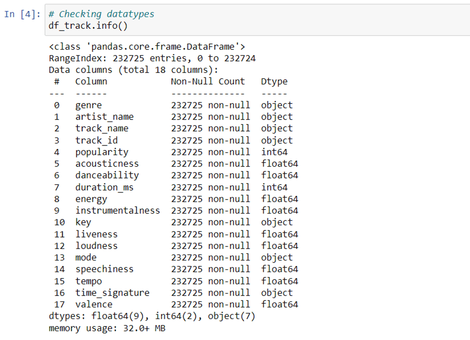
With the help of Pandas library we can use info() to know the datatypes.
Find null values present in the dataset.
The Pandas library includes a function called isnull() that can be used to check for null values in an object.

As we can see that there is no null value in our dataset so, we can move forward and do other analysis.
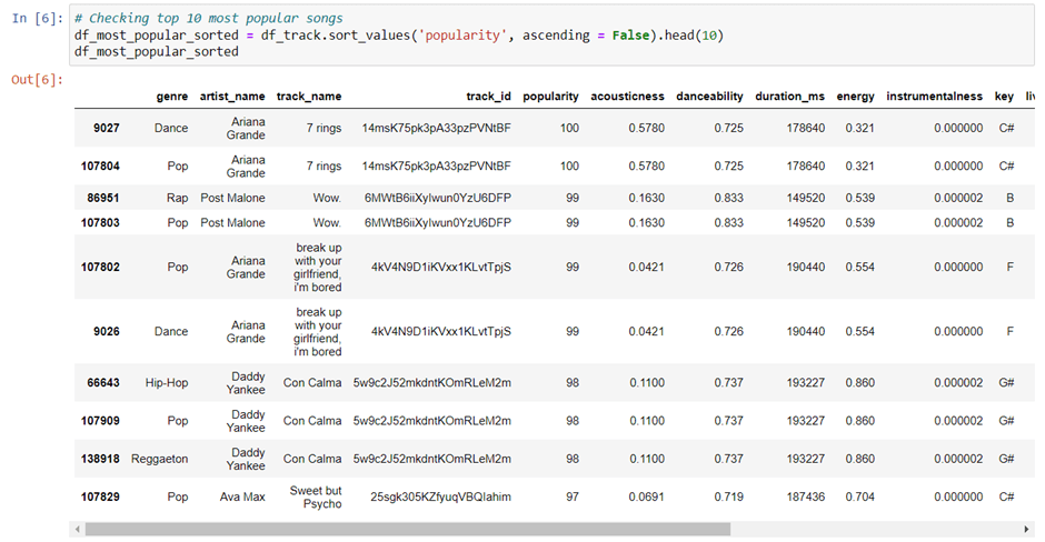
Find Ten Most Popular Songs in the Spotify Dataset.
To get a list of least popular songs, we’ll sort the column popularity in ascending order using the SQL function called sort_values().
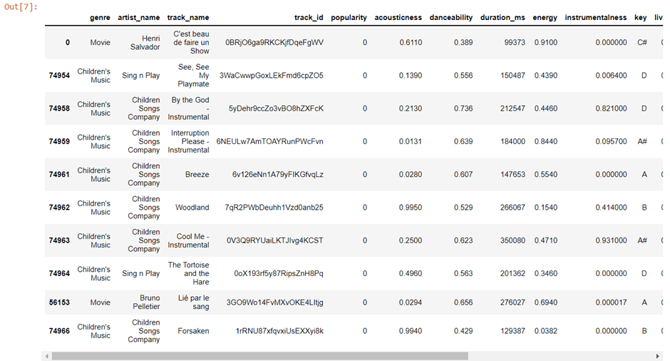
Find Ten Least Popular Songs in the Spotify Dataset.
To get a list of least popular songs, we’ll sort the column popularity in ascending order using the SQL function called sort_values().

Output
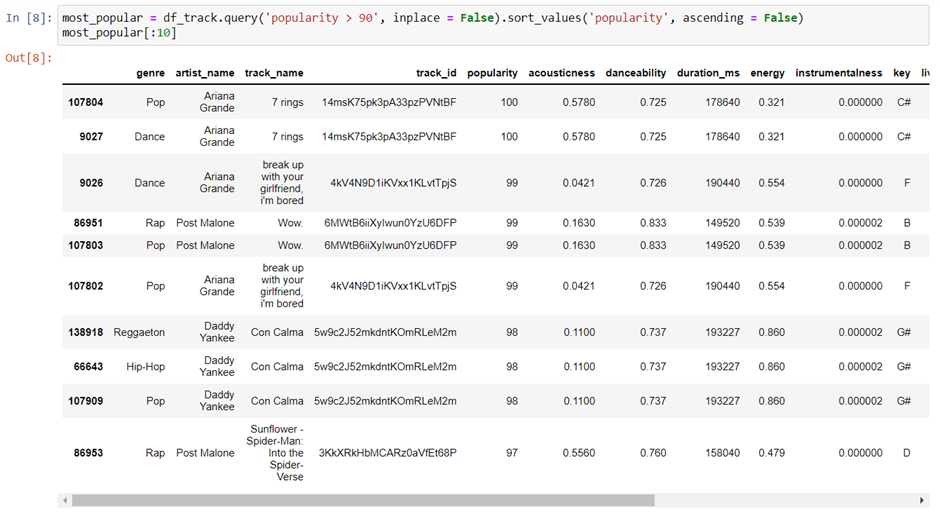
Top Ten Popular Songs with Popularity More Than 90%
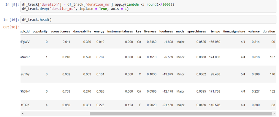
Convert the Duration of the Songs from Milliseconds to Seconds.
We will convert the duration of the songs from milliseconds to seconds and one way we can do this is by printing the headings of the dataset from before to after that conversion. If they are different it usually means we did something wrong.
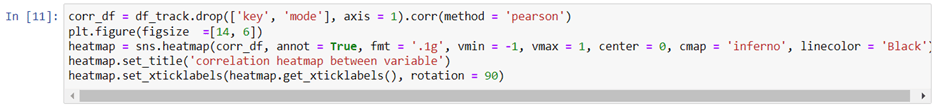
Correlation Map
Now, we will create our first visualization. To do so, we need to drop three columns that aren’t needed for this type of visualization: mode and explicit keys, as well as the pearson correlation method.
We will set the figure size for the correlation map to (14,6). Here is a color map reference. You can google sns cmap and choose any color from the documentation, if you wish.
Output
Let’s Move Ahead and Sample Only 4 Percent of the Whole Dataset.

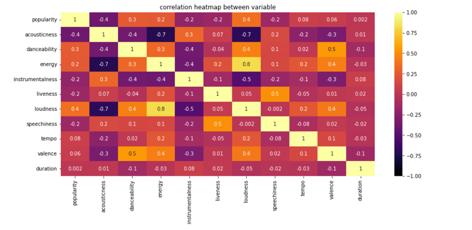
Let’s create a regression plot that shows the relationship between loudness and energy. I’ll plot this regression line below.
We will use a function regplot() present in the seaborn library that allows us to draw regression plots easily.
The result is plotted. As the volume gets louder, the energy values go up. The data points provided are all in one direction, which means that as the volume goes up, so does the energy level. The volume of the song increases in correlation with the pitch, so that if a song is louder, it simultaneously sounds fast. Similarly, if a song’s pitch is higher, its volume also increases correspondingly; if the pitch decreases and gets lower-pitched, then its volume also lowers to match this.
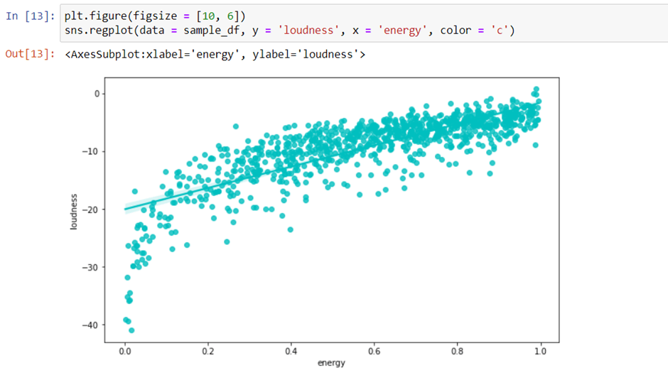
Similarly, we can also plot another regression plot between popularity and energy.
This chart will show the strong correlation between popularity and acousticness of songs.
When we look at the green line in this graph, it is downwards, which signifies that if the acousticness of the song increases, the popularity decreases. Correspondingly, if the popularity increases or even stays stable, the acousticness decreases.
The duration of songs varies quite a lot by genre.
We will use a function called barplot that is present in the seaborn library.
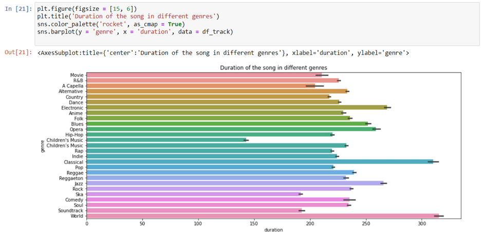
Here, we got the genres on the Y-axis and duration in milliseconds on the X-axis. The data tells us that classical and world genres have a longer duration of songs than music categorized as being for children.
Find top five genres by Popularity and pot a barplot for the same.