In our fast-paced world, data grows more complex each day and, by extension, more challenging to interpret. In machine learning, we use a mathematical technique called Principal Component Analysis (PCA) to simplify our data —that is, reduce features or dimensions while trying to maintain as much information as possible.

Why PCA Matters?
There are various reasons why we might wish to employ PCA. For one, visualizing data presents a challenge because our human minds can’t comprehend data in more than three dimensions simultaneously. If you have multiple features in your dataset, reducing them either to two or three dimensions would be considerably beneficial. In addition to that, PCA is useful in reducing the number of features, thus lessening computational requirements. For instance, the more features there are, the more processing power and time needed, depending on the algorithm used.
Consider this practical example. Suppose you are employed by a company and tasked with projecting the price of houses in your locale. After collecting the relevant data, you end up with several house properties per sample — number of bathrooms, number of bedrooms, and the square footage. Logically, these three properties are highly correlative. A larger house is likely to contain more bedrooms and bathrooms. Therefore, PCA can help consolidate these three property dimensions into one overarching feature— size, perhaps.
PCA – a Simplified Walkthrough
Let’s break down how PCA works using our house-price prediction example. When PCA steps into the picture, it starts by taking all the samples and centering them. Mathematically, the process continues by computing eigenvectors and eigenvalues, which carry significant weight. Simply put, eigenvalues tell you the vector’s magnitude, while eigenvectors reveal the vector’s direction.
Here’s how you can conceive of the process: the vector (or dimension) with the highest eigenvalue explains most of the variance in our data. Thus, we prefer to preserve it and remove the other less critical vectors. we can represent our previous multi-dimensional data on a straightforward one-dimensional plot.
Now, let’s implement it in Python coding. We’ll demonstrate how to implement PCA using Python, and for this exercise, we’ll exploit the Iris dataset.
Firstly, we need to import the required libraries — Pandas (for data manipulation), NumPy (for numerical computations), and Matplotlib (for data visualization).
import pandas as pd
import numpy as np
import matplotlib.pyplot as plt
from sklearn.decomposition import PCA
from sklearn.preprocessing import StandardScaler
from sklearn.datasets import load_iris
Next, we load our dataset using the load iris function, creating Pandas data frames from the returned data.
iris = load_iris()
X = pd.DataFrame(iris.data, columns=iris.feature_names)
y = iris.target
If we display our dataframe X, we will note the four features: sepal length, sepal width, petal length, and petal width. Interestingly, there are likely correlations among these features.
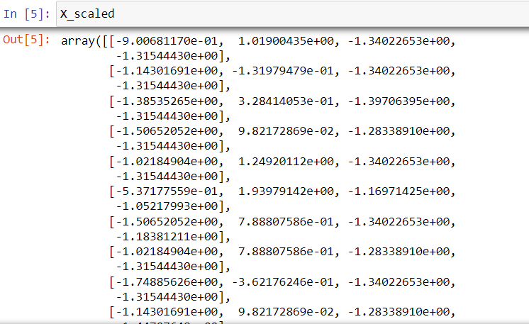
Moving forward with PCA, it’s essential to scale our data. This crucial process reduces the mean of our data to zero and the standard deviation to one — avoiding disproportionate influence from features due to differences in their scales.
X_scaled = StandardScaler().fit_transform(X)
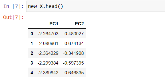
Having scaled our data, we now proceed with PCA. We’ll instantiate PCA with two components since our objective is to reduce our four dimensions down to two. After that, we feed our scaled data into PCA and create our new dataset, new_X.
pca = PCA(n_components=2)

principal_components = pca.fit_transform(X_scaled)

new_X = pd.DataFrame(data = principal_components, columns = ['PC1', 'PC2'])
To visualize the variance explained by each principal component, we’ll generate a Scree plot.
per_var = np.round(pca.explained_variance_ratio_ * 100, decimals = 1)

label = ['PC' + str(x) for x in range(1, len(per_var) + 1)]

plt.bar(x = range(1, len(per_var) + 1), height = per_var, tick_label = label)

plt.ylabel('Percentage of Explained Variance ')
plt.xlabel('Principal Component')
plt.title('Scree Plot')
plt.show()
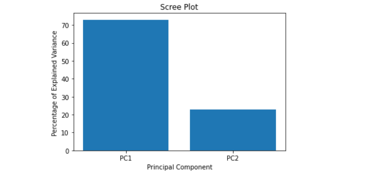
The Scree plot will reveal that the first principal component accounts for approximately 70% of the variance, and the second component accounts for about 25%.
Conclusion
Considering we’ve reduced our data dimensions from four to two and lost only a small percentage of the variance, PCA has done a remarkable job. In conclusion, if you find yourself grappling with a dataset with a large number of features or needing to visualize a high dimensional dataset, consider giving PCA a try!
If you found this article helpful and insightful, I would greatly appreciate your support. You can show your appreciation by clicking on the button below. Thank you for taking the time to read this article.
Popular Posts
- From Zero to Hero: The Ultimate PyTorch Tutorial for Machine Learning Enthusiasts
- Day 3: Deep Learning vs. Machine Learning: Key Differences Explained
- Retrieving Dictionary Keys and Values in Python
- Day 2: 14 Types of Neural Networks and their Applications